
Designing with Pencil and Claude Code
I’ve been building two internal tools at Lullabot lately. OpptyNet finds government RFPs for us. Upstraker tracks upstream patches across our open source contributions. Both needed real UI design, not just “make it work” design. And I found myself doing that design work almost entirely through conversation.
The tool is called Pencil. It’s a design editor that integrates with Claude Code through MCP, so you can describe what you want, iterate on layouts, build component libraries, and screenshot your work without leaving the terminal. The .pen files it produces are encrypted, only accessible through the Pencil tools themselves. You don’t open them in Figma. You don’t drag boxes around with a mouse. You talk about what you need and the design materializes.
I was skeptical. But after running two projects through it, I’m genuinely impressed with how well it works.
Starting wrong (and backing up)
With OpptyNet, I made the classic mistake. I jumped straight to pixels. Back in late March I had Claude whip up some UI brainstorms, an opportunity detail page, a dashboard list view, and they looked fine. Plausible even. But they were decorating a house before pouring the foundation.
So I backed up. I pulled out the Ponchot methodology, a lean design process we use at Lullabot, and actually did the work. Purpose definition first. Who is this for? What does success look like? The answer was specific: this is for Jenna, our business development person, and she needs to go from email digest to go/no-go decision in under 60 seconds per opportunity. That’s the whole job.
Then content modeling. Priority-driven requirements. A design system built on our existing Lullabot brand library. Then pixels.
The Lullabot design library
One of the more satisfying pieces of this project was building a proper Pencil design library for Lullabot. Fifty-six color variables. Typography tokens using Circular and IBM Plex Mono. A spacing scale on a 4px grid. Sixteen reusable components: buttons, cards, form inputs, nav links, badges, tags, blockquotes. The whole brand system in a .pen file that any project can import.
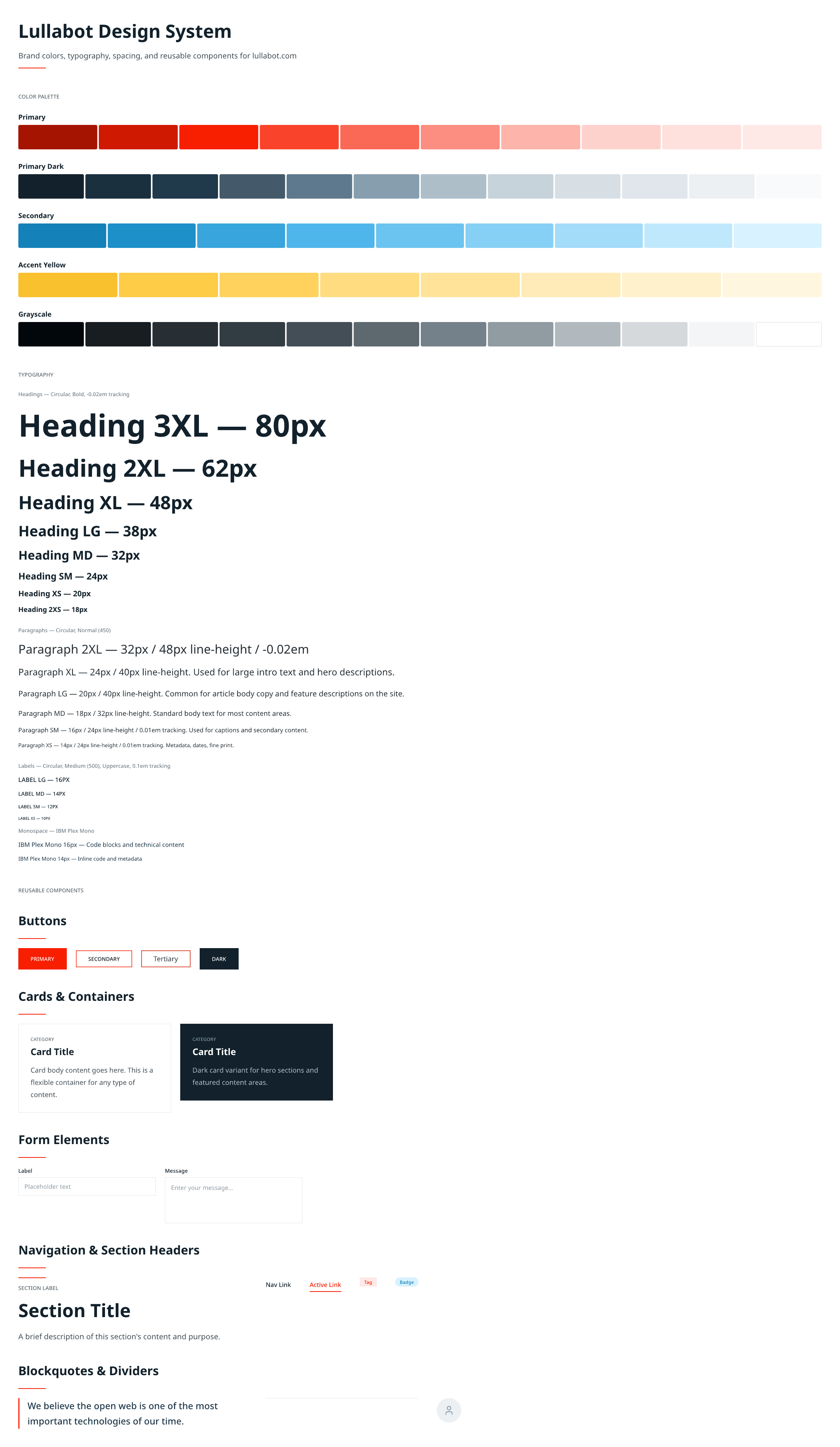 The Lullabot design library: color palettes, typography, spacing, and reusable components.
OpptyNet imports it. Upstraker imports it. When I start the next internal tool, it’ll import it too. Two projects in and the library is already saving me real time.
Seven versions of OpptyNet
Once I had the foundation, the purpose statement, the content model, the design tokens, I started iterating in Pencil. Because the feedback loop is just conversation, the iterations came fast.
V1 was card-based. A list of opportunity cards with a filter bar and pagination. Standard stuff, but too much visual weight per item. Jenna needs to scan 20-50 opportunities. Cards are too heavy for that.
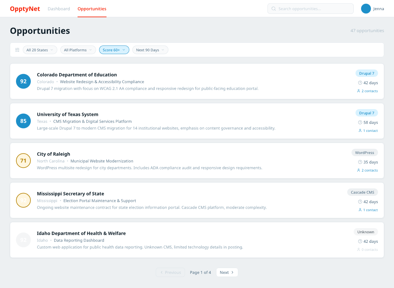 V1: opportunity cards with score badges, platform tags, and deadline countdowns. Looks nice, scans slow.
V2 went dense, a table layout with inline score bars. Better for scanning. But it lost the warmth. Felt like a spreadsheet, and the whole point was to be better than the spreadsheet she already has.
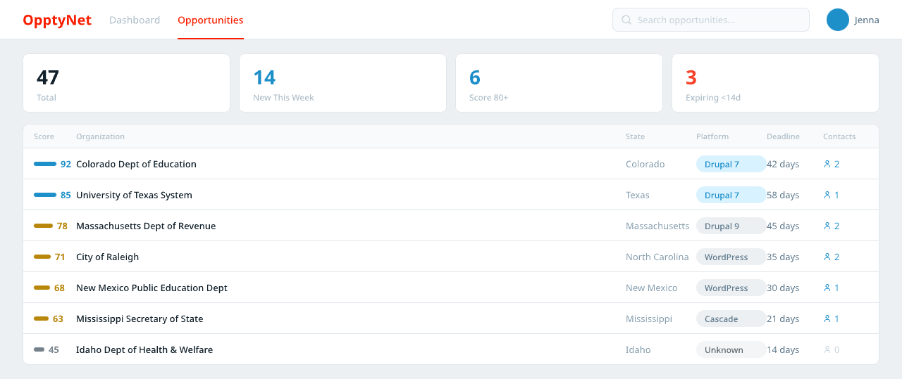 V2: compact table rows with stat ribbon. Faster to scan, but sterile.
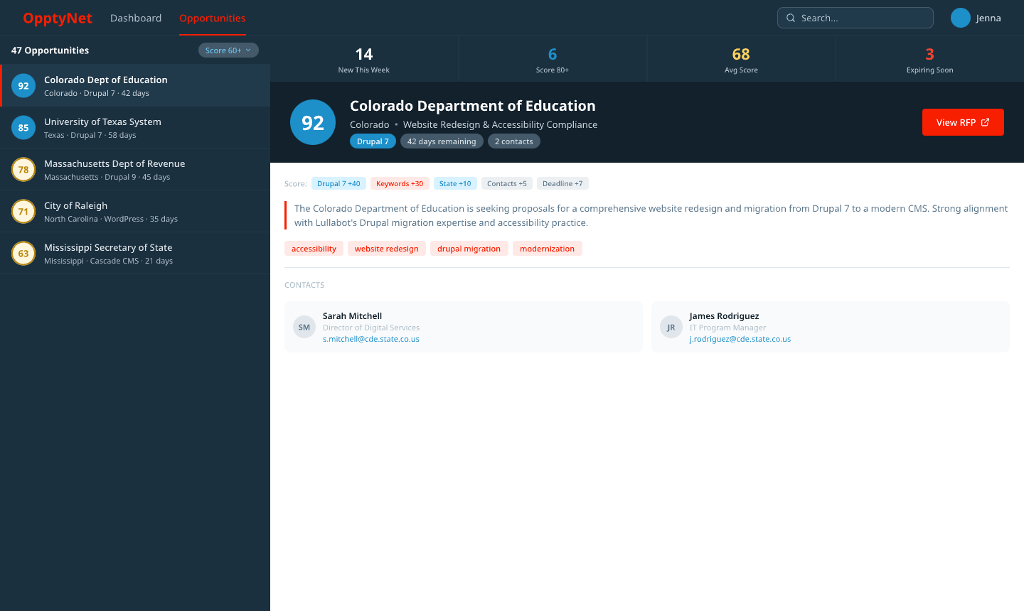
V3 tried a split panel, like an email client. List on the left, preview on the right. This was the layout that stuck. You scan on the left, evaluate on the right. No page transitions, no context switching.
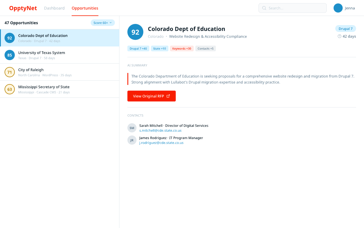 V3: the split panel layout that stuck. List left, detail right.
V4 and V5 were mashups, combining the split panel with a dark hero banner for the selected opportunity, stat cards, score breakdowns alongside contacts. Getting closer, but cluttered.
 V4: dark hero banner meets split panel. The layout is finding its shape.
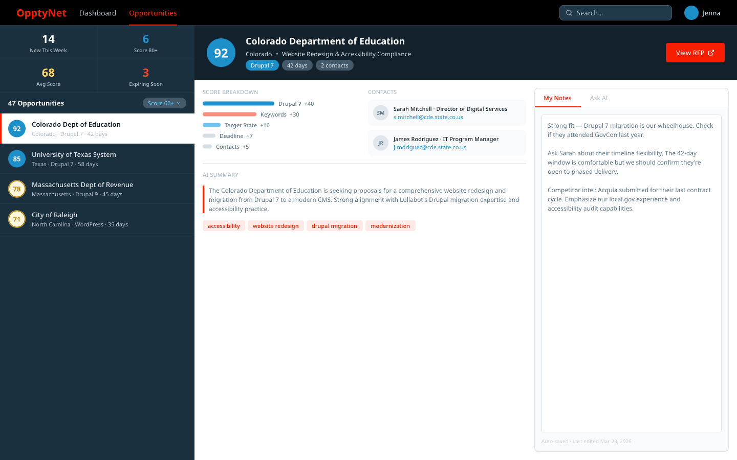 V5: stats, contacts, notes, and AI chat all present. Too much competing for space.
Then I ran the Ponchot critique against V5. The stats were eating too much vertical space. There were no filters, which is a bad miss when your design principle is “spreadsheet speed.” The Ask AI feature, which is arguably the differentiator, was hidden in a tab.
V6 fixed all of that. Stats compressed to a single ribbon. Filter pills below the list header. Ask AI pinned to the bottom, always visible. Keywords gone because they were redundant with the score breakdown.
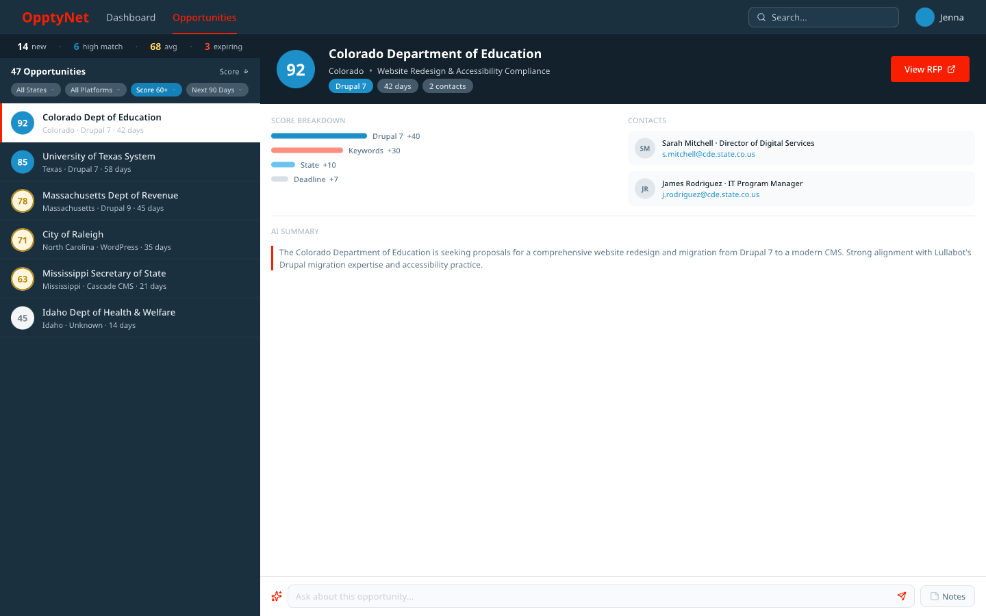 V6: filters added, stats compressed, Ask AI always visible at the bottom.
V7 was polish. Starbridge, the $15K/year tool we’re replacing, has this restrained luxury feel. So I added ambient glows on score badges. A subtle gradient on the dark left panel instead of flat color. Red glow on action buttons. Cards with soft shadows instead of borders. Nothing that changes the information architecture, just surfaces that feel crafted.
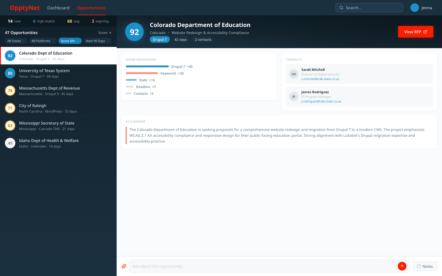 V7: the final design. Ambient glows, gradient panel, soft shadows. Same bones as V6, better skin.
Seven versions. One conversation thread. Maybe three hours of actual work. That last part still surprises me.
Upstraker: starting from the library
With Upstraker, I already had the Lullabot design library in place. The concepts came together faster because I wasn’t building the visual language from scratch. Same brand tokens, same component patterns, different product.
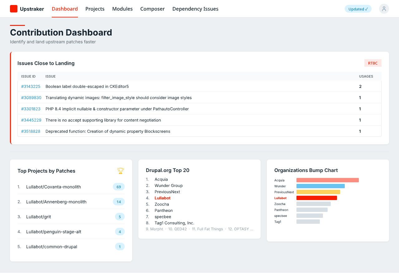 Upstraker’s contribution dashboard: issues close to landing, top projects by patches, and an org bump chart.
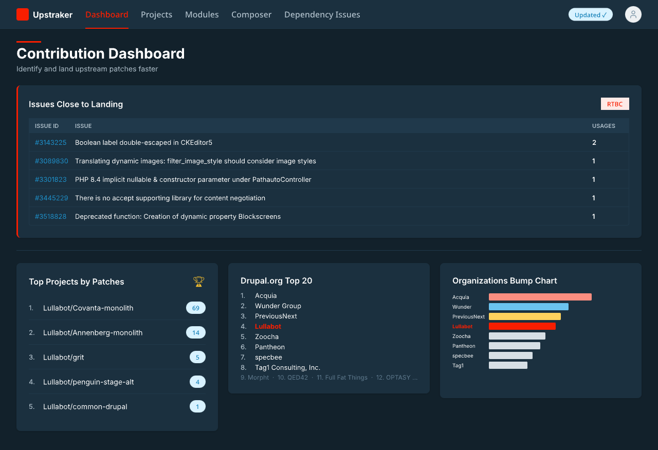 The same dashboard in dark mode. Both themes came out of the same design library tokens.
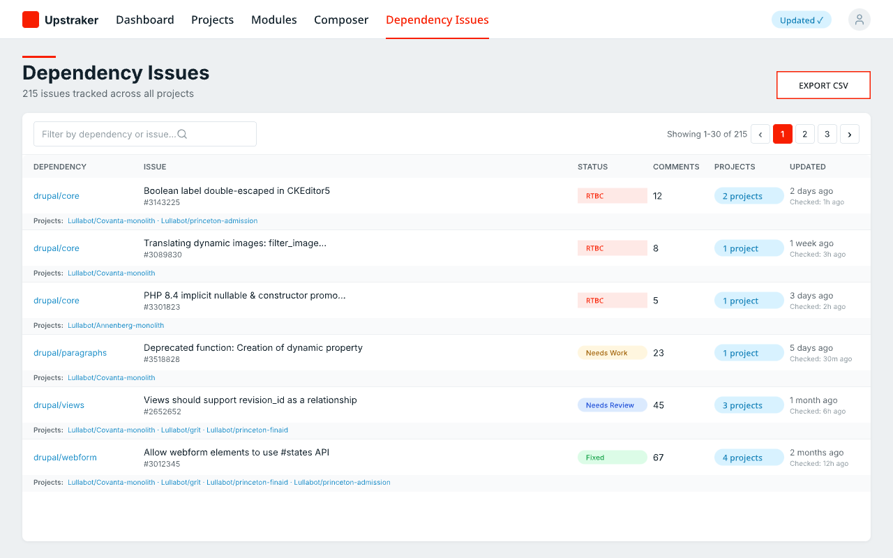 The dependency issues view, tracking patches across all projects.
Having a shared design library is weirdly freeing. You stop thinking about what shade of blue to use and start thinking about what the interface actually needs to do.
What I walked away with
The Ponchot process caught gaps that seven iterations of pixel-pushing wouldn’t have found. The missing filters. The buried AI feature. Those were purpose problems, not visual problems. No amount of glow effects would’ve fixed them. I keep learning this lesson and then forgetting it: methodology before pixels.
The speed of conversation-driven design caught me off guard too. When the iteration cycle is just “that’s not quite right, try compressing the stats to one line,” you cover ground fast. No switching between Figma and a chat window and a browser. The design and the code live in the same environment, which means they share context from the start.
I’m not ready to say Pencil replaces a dedicated design tool in every case. But for internal tools and rapid prototyping, it handled everything I threw at it. And the design library I built for the first project made the second one noticeably easier. I’m curious what the third one will feel like.